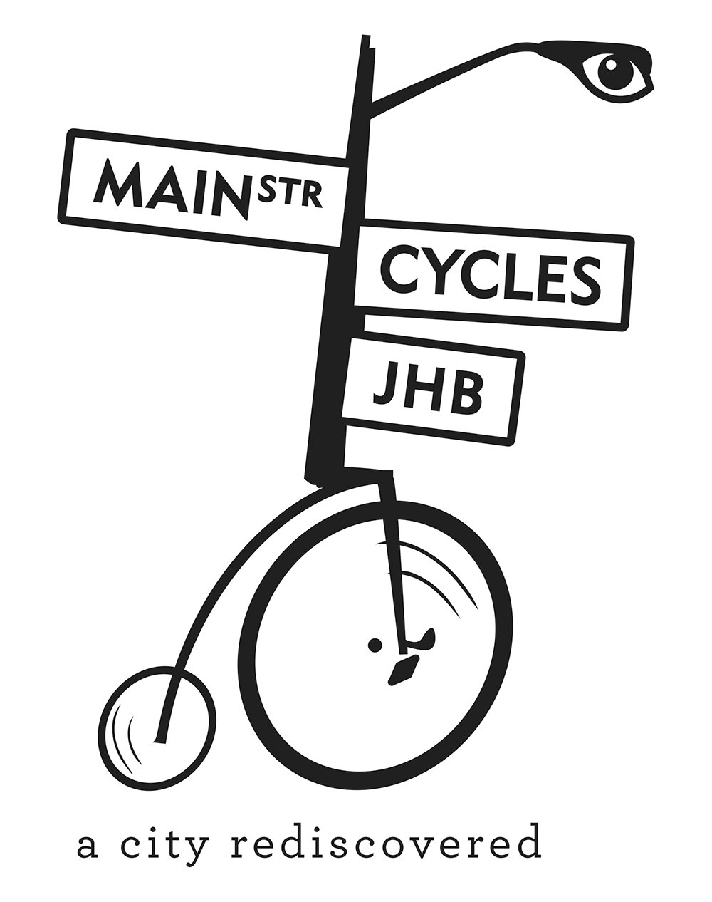
Main Street Cycles
Brand extension for Main Street Walks
Client: Main Street Cycles
Status: Completed
Industry: Tourism
Region: South Africa
Brief
Main Street Walks added a cycling tour to a part of their offering and wanted it to have its own visual identity.
It had to be clearly identifiable with the Main Street Walks brand and be able to leverage the already established visual language of Main Street Walks but stand on its own.
Reference and Research

Reference Imagery
I was given the original logo and a series of images that inspired it as a reference to build the logo for Main Street Cycles.
Downtown Johannesburg has a wealth of unique Art Deco and other period buildings still standing. These buildings form the basis of several of the tours offered by Main Street Walks.
Process
The first attempts and sketches referenced modern bicycles. However, nothing quite fit. The form of a modern bicycle didn’t fit with the tall verticality of the Main Street Walks logo.
The answer came in re-examining the reference imagery. Below are images of cyclists. They are all hunched over, horizontal. they are highly directional and laser-focused.
To the left are photos from some of the first tours offered by Main Street Walks/Cycles. People are upright. They’re looking around. There is a verticality to them that matches the posture of the Main Street Walks logo..


The penny farthing bicylce proved to be the solution. It aligned both it the spiritually with the period architecture of old town Johannesburg and the verticality referenced in the tour imagery.